Byverkstedet is interdisciplinary collective that works with urban development.
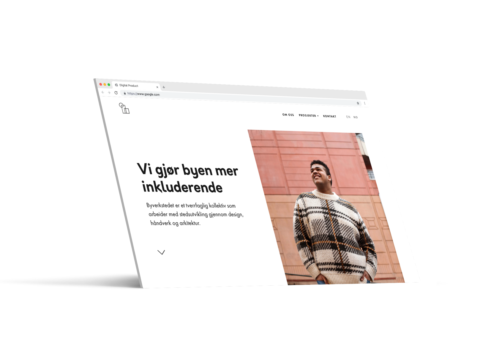
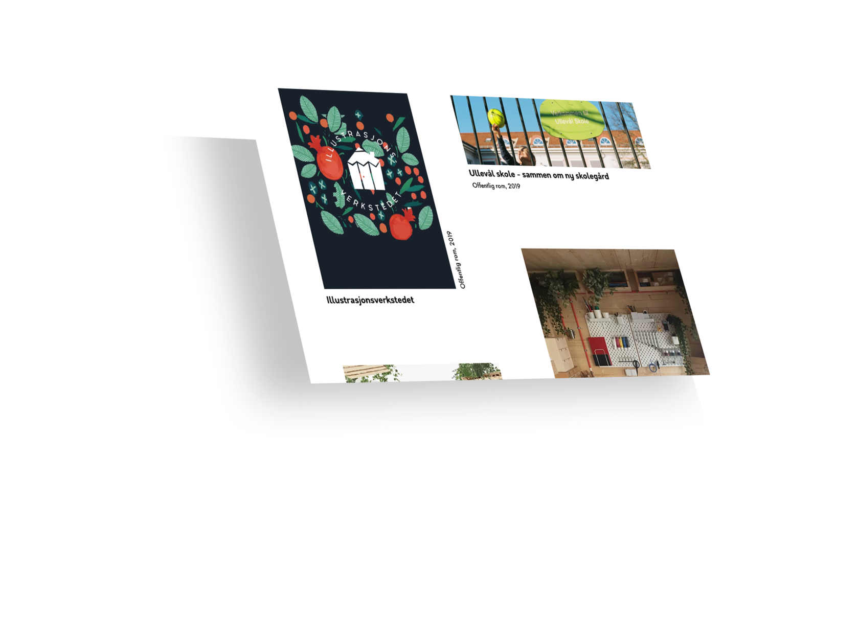
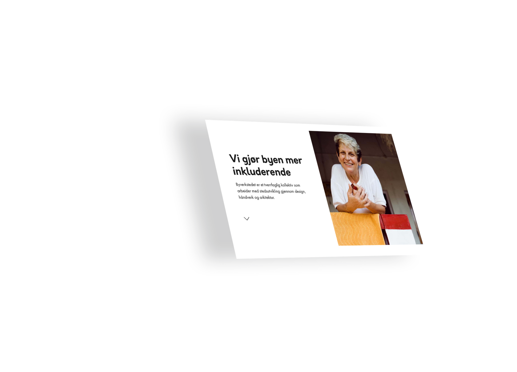
They actively influence Oslo's cultural and societal infrastructure through design, crafts, and architecture. They contacted us and asked us to help them design their new website. We have started work on the project with an already existing newly designed logo and a beautiful photoshoot by Oda of the people that work for the Byverkstedet.
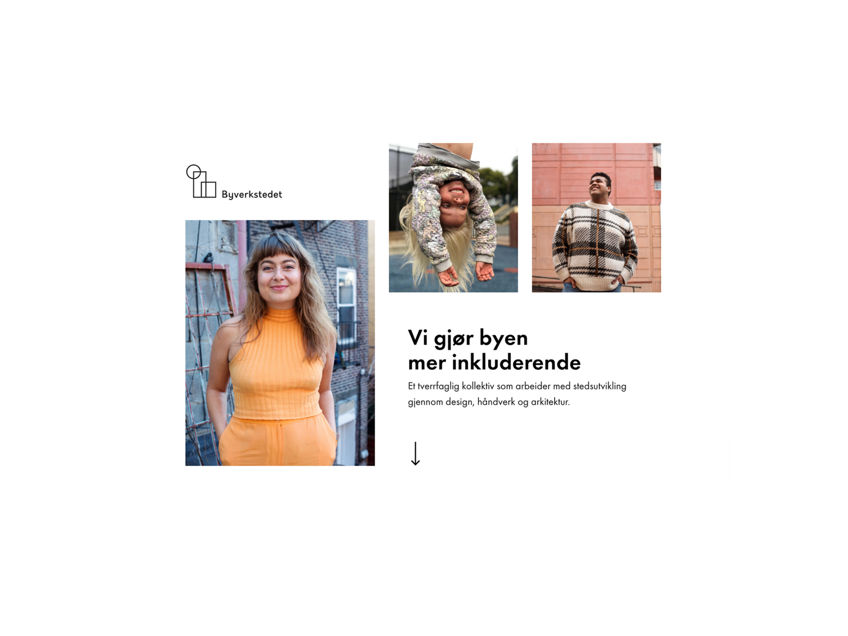
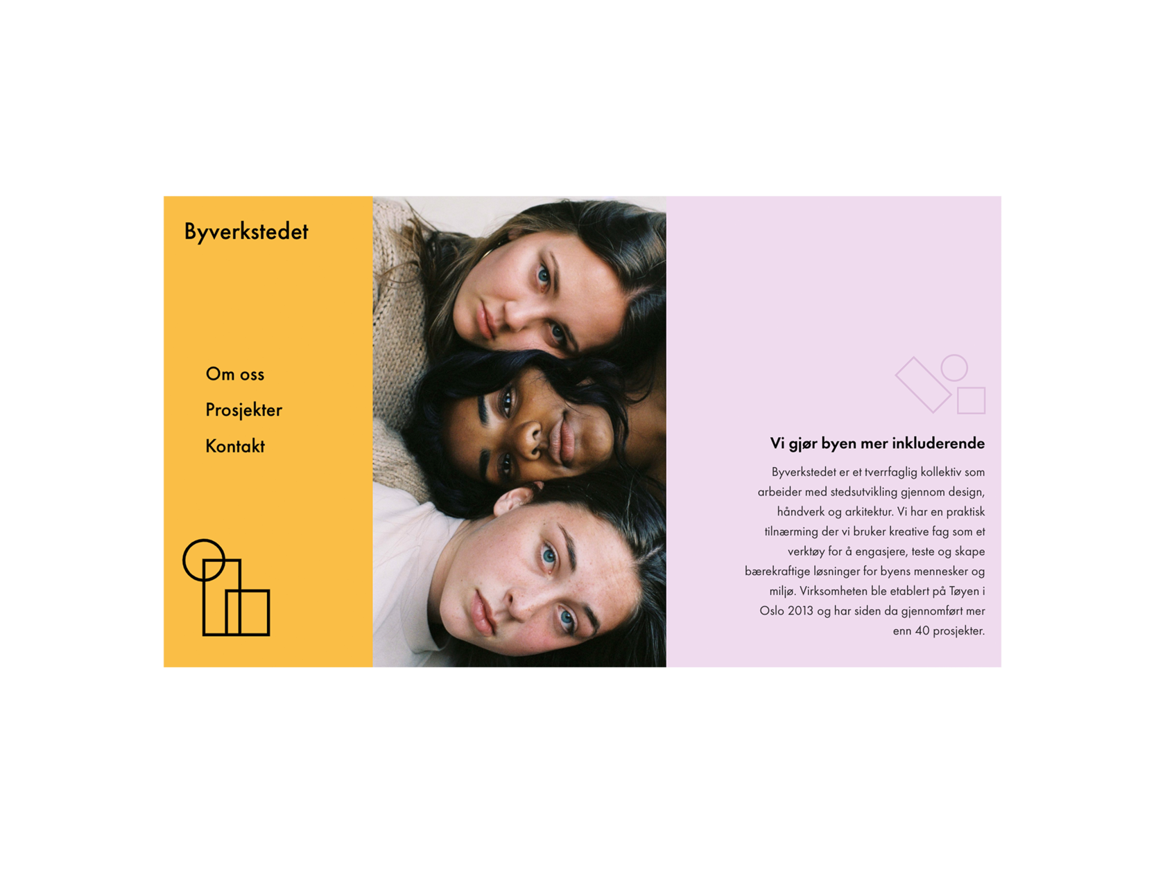
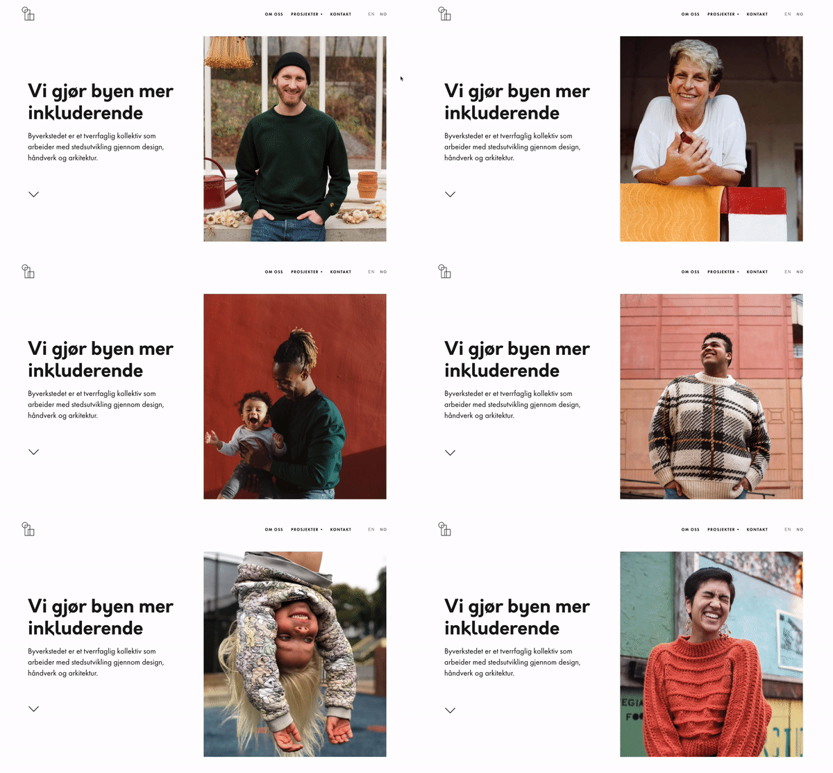
We focused on the idea that it is people who make great, more inclusive and liveable cities.
We focused on the idea that it is people who make great, more inclusive and liveable cities.
Creating a website always starts with a few sketches



We decided to use two typefaces
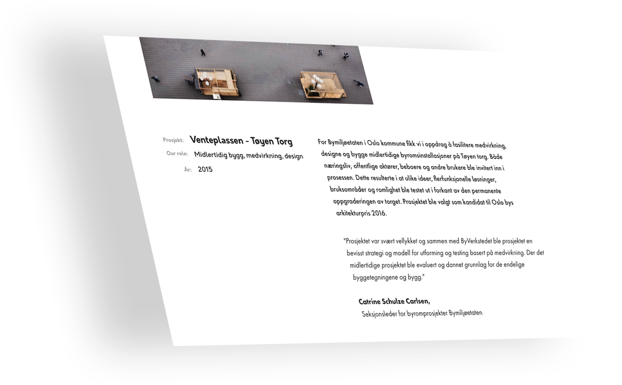
We wanted to keep the typography simple and clean, yet fun. We decided to use two typefaces. #1 - Orkney was a perfect for the job. The details in the font, especially letter 'w', 'k' and 'y' make is less of an obvious choice. Orkney is used in bold in all the headlines. We paired it with #2 - Futura PT. It is used for all the body text. It is a classic, modern typeface and is one of our favourite font to use.
Orkney + Futura Pt = <3
Orkney + Futura Pt = <3


